Honey Love
Package Design | Graphic Design | Motion Design
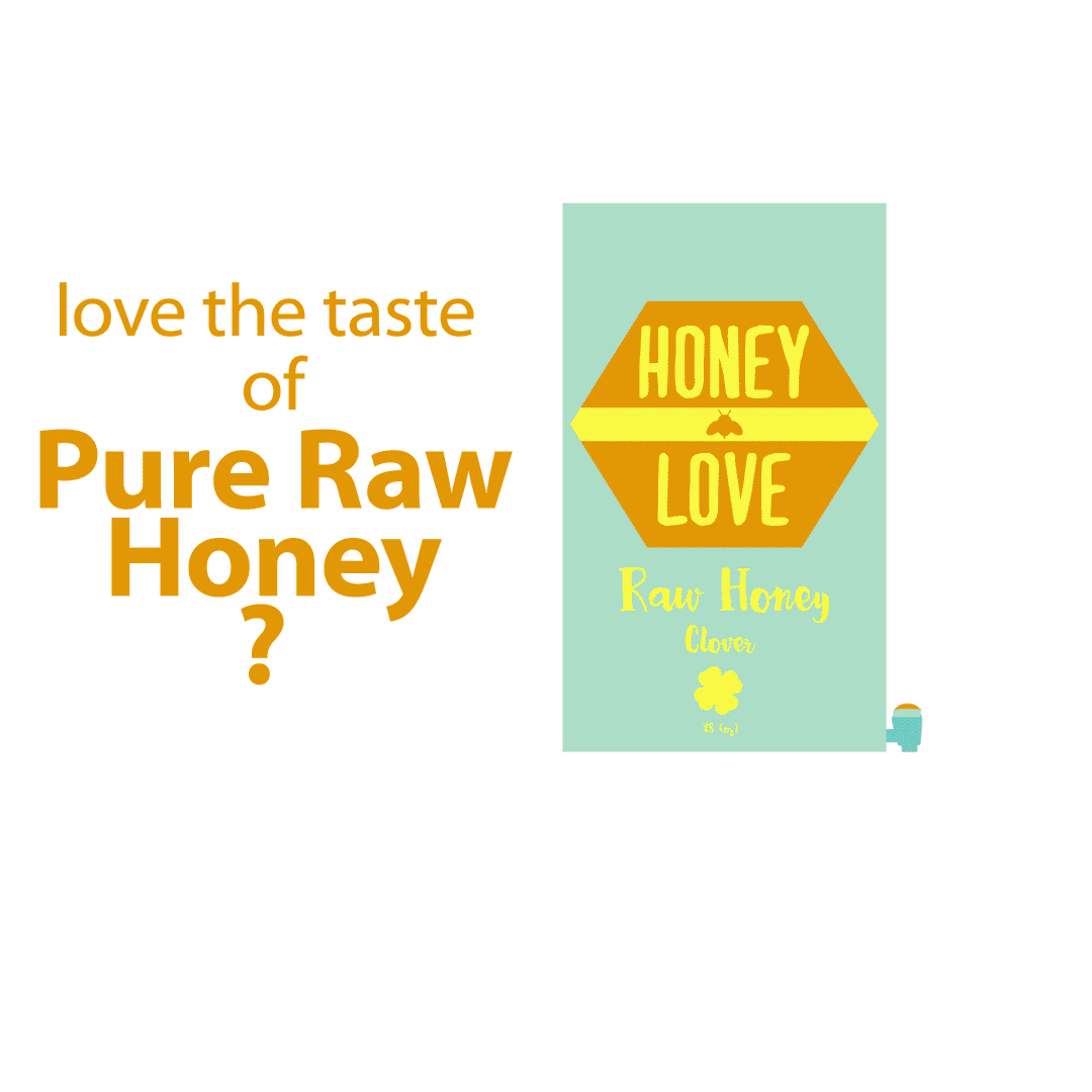
Honey love is a design project that focuses on how to keep sticky honey in a better pourable container for consumers who buy honey in bulk. Mostly looking at coffee shops and tea shops or the average person who REALLY likes honey. Thinking about the amount and consistency of honey we thought that using gravity to pull into a spout would work the best. We thought that this would be a perfect solution to a sticky spoon or container. Referencing boxed wine and laundry detergent we thought this design would give the customers an easy grip and no mess solution.
Packaging and branding: The box would be about a standard box wine height and width allowing for easy bulk transport. The cardboard box would be perfect to break down and recycle when done.
The color teal was used to use as a complementary color to make the box stand out. When looking at honey labels and products most of them are only yellow. Making the box teal with yellow accents still gets honey across but also makes the box stand out alongside other honey products.
Motion design: Since the logo itself was a golden yellow color we though why not show how the product works and make our logo at the same time. I wanted to show the fluidity of the honey and how the product would keep a mess free environment.